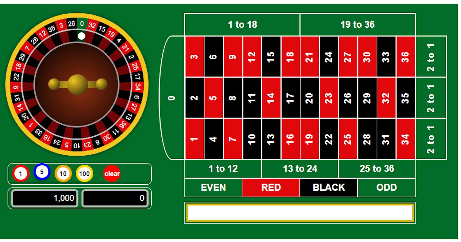

In part one we built the betting board and gave it some minimal styling. In this part I'm going to be building the wheel and testing its rotation.
Here, I created a function called buildWheel
function buildWheel(){}
Inside that function I created the wheel wrapper
let wheel = document.createElement('div');
wheel.setAttribute('class', 'wheel');
Then I added the outer rim
let outerRim = document.createElement('div');
outerRim.setAttribute('class', 'outerRim');
wheel.append(outerRim);
Next I placed all the possible numbers into an array in the order they appear on the wheel and added each block to the wrapper
let numbers = [0, 32, 15, 19, 4, 21, 2, 25, 17, 34, 6, 27, 13, 36, 11, 30, 8, 23, 10, 5, 24, 16, 33, 1, 20, 14, 31, 9, 22, 18, 29, 7, 28, 12, 35, 3, 26];
for(i = 0; i < numbers.length; i++){
    let a = i + 1;
    let spanClass = (numbers[i] < 10)? 'single' : 'double';
    let sect = document.createElement('div');
    sect.setAttribute('id', 'sect'+a);
    sect.setAttribute('class', 'sect');
    let span = document.createElement('span');
    span.setAttribute('class', spanClass);
    span.innerText = numbers[i];
    sect.append(span);
    let block = document.createElement('div');
    block.setAttribute('class', 'block');
    sect.append(block);
    wheel.append(sect);
}
which in HTML translates to
<div id="sect1" class="sect">
    <span class="single">0</span>
    <div class="block"></div>
</div>
where 1 and 0 will equal whichever iteration the "a" and "numbers[i]" variable are on respectively.
Next I added in the pockets rim element
let pocketsRim = document.createElement('div');
pocketsRim.setAttribute('class', 'pocketsRim');
wheel.append(pocketsRim);
Followed by the ball track element
let ballTrack = document.createElement('div');
ballTrack.setAttribute('class', 'ballTrack');
The ball track is the line the ball is going to follow when the wheel is spinning. Next we need to add the ball to the track and add the track to the wheel
let ball = document.createElement('div');
ball.setAttribute('class', 'ball');
ballTrack.append(ball);
wheel.append(ballTrack);
Next I added the pockets element which, once styled, will just be a smaller black circle over the larger circle at half opacity to make the pockets look darker than the numbers
let pockets = document.createElement('div');
pockets.setAttribute('class', 'pockets');
wheel.append(pockets);
Then I added the cone, which is the centre circle of the wheel
let cone = document.createElement('div');
cone.setAttribute('class', 'cone');
wheel.append(cone);
Finally I added in the turret, which is the decoration in the centre of the wheel. I did this in two parts, first the centre piece
let turret = document.createElement('div');
turret.setAttribute('class', 'turret');
wheel.append(turret);
Followed by the handles
let turretHandle = document.createElement('div');
turretHandle.setAttribute('class', 'turretHandle');
let thendOne = document.createElement('div');
thendOne.setAttribute('class', 'thendOne');
turretHandle.append(thendOne);
let thendTwo = document.createElement('div');
thendTwo.setAttribute('class', 'thendTwo');
turretHandle.append(thendTwo);
wheel.append(turretHandle);
Then I appended the wheel to the container
container.append(wheel);
and called on the function just above the buildBettingBoard function call
buildWheel();
buildBettingBoard();
That's it for the buildWheel function. Now when you load the page you'll see the numbers running down the page. Time to add in some style.
First there's the main wheel element
.wheel {
    height: 312px;
    width: 312px;
    position: relative;
    left: -75px;
}
Then I worked on placing in the numbers. Basically, I just created a pie chart with 37 equal pieces that alternated between red and black with 1 green section. There are 360 degrees in a circle, 360 / 37 just about equals 9.73
.block {
    transition: all 1s;
    position: absolute;
    width: 290px;
    height: 290px;
    border-radius: 100%;
    clip: rect(0px, 145px, 290px, 0px);
}

.sect {
    position: absolute;
    top:10px;
    left:10px;
    width: 290px;
    height: 290px;
    border-radius: 100%;
    clip: rect(0px, 290px, 290px, 145px);
}

#sect1 .block {
    background-color: #016D29;
    transform:rotate(9.73deg);
}

#sect2 .block, #sect4 .block, #sect6 .block, #sect8 .block, #sect10 .block, #sect12 .block, #sect14 .block, #sect16 .block, #sect18 .block, #sect20 .block, #sect22 .block, #sect24 .block, #sect26 .block, #sect28 .block, #sect30 .block, #sect32 .block, #sect34 .block, #sect36 .block {
    background-color: #E0080B;
    transform: rotate(9.73deg);
}

#sect3 .block, #sect5 .block, #sect7 .block, #sect9 .block, #sect11 .block, #sect13 .block, #sect15 .block, #sect17 .block, #sect19 .block, #sect21 .block, #sect23 .block, #sect25 .block, #sect27 .block, #sect29 .block, #sect31 .block, #sect33 .block, #sect35 .block, #sect37 .block {
    background-color: #000;
    transform: rotate(9.73deg);
}
Then I rotated each section plus 9.73deg of the section before
#sect2 {
    transform: rotate(9.73deg);
}

#sect3 {
    transform: rotate(19.46deg);
}

#sect4 {
    transform: rotate(29.19deg);
}

#sect5 {
    transform: rotate(38.92deg);
}

#sect6 {
    transform: rotate(48.65deg);
}

#sect7 {
    transform: rotate(58.38deg);
}

#sect8 {
    transform: rotate(68.11deg);
}

#sect9 {
    transform: rotate(77.84deg);
}

#sect10 {
    transform: rotate(87.57deg);
}

#sect11 {
    transform: rotate(97.3deg);
}

#sect12 {
    transform: rotate(107.03deg);
}

#sect13 {
    transform: rotate(116.76deg);
}

#sect14 {
    transform: rotate(126.49deg);
}

#sect15 {
    transform: rotate(136.22deg);
}

#sect16 {
    transform: rotate(145.95deg);
}

#sect17 {
    transform: rotate(155.68deg);
}

#sect18 {
    transform: rotate(165.41deg);
}

#sect19 {
    transform: rotate(175.14deg);
}

#sect20 {
    transform: rotate(184.87deg);
}

#sect21 {
    transform: rotate(194.6deg);
}

#sect22 {
    transform: rotate(204.33deg);
}

#sect23 {
    transform: rotate(214.06deg);
}

#sect24 {
    transform: rotate(223.79deg);
}

#sect25 {
    transform: rotate(233.52deg);
}

#sect26 {
    transform: rotate(243.25deg);
}

#sect27 {
    transform: rotate(252.98deg);
}

#sect28 {
    transform: rotate(262.71deg);
}

#sect29 {
    transform: rotate(272.44deg);
}

#sect30 {
    transform: rotate(282.17deg);
}

#sect31 {
    transform: rotate(291.9deg);
}

#sect32 {
    transform: rotate(301.63deg);
}

#sect33 {
    transform: rotate(311.36deg);
}

#sect34 {
    transform: rotate(321.09deg);
}

#sect35 {
    transform: rotate(330.82deg);
}

#sect36 {
    transform: rotate(340.55deg);
}

#sect37 {
    transform: rotate(350.28deg);
}
Next I positioned and sized the numbers and gave them a colour of white.
.double, .single{
    position: absolute;
    z-index: 1;
    color: #fff;
    font-size: 14px;
    transform: rotate(3deg);
}

.double{
    left: 148px;
    margin-top: 4.5px;
}

.single{
    left: 152px;
    margin-top: 4.5px;
}
Then the outer rim.
.outerRim {
    position: absolute;
    left:0;
    top:0;
    width: 290px;
    height: 290px;
    border-radius: 100%;
    box-shadow: 0px 0px 8px rgba(0,0,0,0.5);
    border: 10px solid #F3c620;
}
Followed by the pockets rim, which I made thinner and silver
.pocketsRim {
    position: absolute;
    top: 34px;
    left: 34px;
    width: 235px;
    height: 235px;
    border-radius: 100%;
    border: 3px solid #c0c0c0;
}
Then the ball track. Originally the track had a border so I could align the ball. The the track will be the element that is rotating while the ball always stays in the same position it's been set on the track, giving the impression the ball is rotating around the track. After the ball was positioned, I removed the border.
.ballTrack{
    width: 212px;
    height: 207px;
    position: absolute;
    left: 47.5px;
    top: 50px;
    border-radius: 100%;
    z-index:2;
}
followed by positioning and shaping the ball
.ball{
    background-color: #fff;
    width: 16px;
    height: 16px;
    border-radius: 100%;
    position: relative;
    left: 109px;
    top: -8px;
}
Next, I styled the pockets.
.pockets {
    position: absolute;
    top: 37px;
    left: 37px;
    width: 235px;
    height: 235px;
    background-color: #000;
    border-radius: 100%;
    opacity: .5;
}
followed by the cone
.cone {
    position: absolute;
    top: 62px;
    left: 61px;
    height: 180px;
    width: 180px;
    border: 3px solid #9f9a9a;
    border-radius: 100%;
    background: radial-gradient(circle at 100px 100px, #892c10, #000);
}
and finished it off with the turret. I did this in 3 pieces: the centre, the handles and the handle decoration
.turret{
    border-radius: 100%;
    background: radial-gradient( circle at 30% 30%, #f3c620, #1a1608 );
    width: 45px;
    height: 45px;
    position: absolute;
    top: 133px;
    left: 134px;
    z-index: 1;
}

.turretHandle{
    background: radial-gradient( circle at 44%, #f3c620, #6a570f);
    width: 87px;
    height: 14px;
    position: absolute;
    left: 113px;
    top: 148px;
}

.thendOne, .thendTwo{
    border-radius: 100%;
    background: radial-gradient( circle at 30% 30%, #f3c620, #1a1608 );
    width: 25px;
    height: 25px;
    position: absolute;
}

.thendOne{
    top: -6px;
    left: -20px;
}

.thendTwo{
    top: -6px;
    left: 83px;
}
That's almost it for the wheel, now when the page is refreshed we have a stationary wheel on the screen. Now we just need to see how it looks when it's rotating. The wheel will be rotating clockwise and the ball will be spinning anti-clockwise. First we add in the keyframes
@keyframes wheelRotate {
    from {
        transform: rotate(0deg);
    }
    to {
        transform: rotate(359deg);
    }
}
@keyframes ballRotate {
    from {
        transform: rotate(0deg);
    }
    to {
        transform: rotate(-359deg);
    }
}
Then added in the animation command in the wheel and ballTrack elements
.wheel {
    height: 312px;
    width: 312px;
    position: relative;
    left: -75px;
    animation: wheelRotate 5s linear infinite;
}

.ballTrack{
    width: 212px;
    height: 207px;
    position: absolute;
    left: 47.5px;
    top: 50px;
    border-radius: 100%;
    z-index:2;
    animation: ballRotate 1s linear infinite;
}
For now it's set to infinite. When the page is refreshed, we'll see a turning wheel with a spinning ball next to the betting table, or something like this
The full code up to this point is available here.
The full code for this part:
css
html, body{
    font-family: arial;
    cursor: default;
    -webkit-touch-callout: none;
    -webkit-user-select: none;
    -khtml-user-select: none;
    -moz-user-select: none;
    -ms-user-select: none;
    user-select: none;
}

#container{
    display: flex;
    justify-content: center;
    align-items: center;
}

@keyframes wheelRotate {
    from {
        transform: rotate(0deg);
    }
    to {
        transform: rotate(359deg);
    }
}
@keyframes ballRotate {
    from {
        transform: rotate(0deg);
    }
    to {
        transform: rotate(-359deg);
    }
}

.wheel {
    height: 312px;
    width: 312px;
    position: relative;
    left: -75px;
  animation: wheelRotate 5s linear infinite;
}

.block {
    transition: all 1s;
    position: absolute;
    width: 290px;
    height: 290px;
    border-radius: 100%;
    clip: rect(0px, 145px, 290px, 0px);
}

.sect {
    position: absolute;
    top:10px;
    left:10px;
    width: 290px;
    height: 290px;
    border-radius: 100%;
    clip: rect(0px, 290px, 290px, 145px);
}

#sect1 .block {
    background-color: #016D29;
    transform:rotate(9.73deg);
}

#sect2 .block, #sect4 .block, #sect6 .block, #sect8 .block, #sect10 .block, #sect12 .block, #sect14 .block, #sect16 .block, #sect18 .block, #sect20 .block, #sect22 .block, #sect24 .block, #sect26 .block, #sect28 .block, #sect30 .block, #sect32 .block, #sect34 .block, #sect36 .block {
    background-color: #E0080B;
    transform: rotate(9.73deg);
}

#sect3 .block, #sect5 .block, #sect7 .block, #sect9 .block, #sect11 .block, #sect13 .block, #sect15 .block, #sect17 .block, #sect19 .block, #sect21 .block, #sect23 .block, #sect25 .block, #sect27 .block, #sect29 .block, #sect31 .block, #sect33 .block, #sect35 .block, #sect37 .block {
    background-color: #000;
    transform: rotate(9.73deg);
}

#sect2 {
    transform: rotate(9.73deg);
}

#sect3 {
    transform: rotate(19.46deg);
}

#sect4 {
    transform: rotate(29.19deg);
}

#sect5 {
    transform: rotate(38.92deg);
}

#sect6 {
    transform: rotate(48.65deg);
}

#sect7 {
    transform: rotate(58.38deg);
}

#sect8 {
    transform: rotate(68.11deg);
}

#sect9 {
    transform: rotate(77.84deg);
}

#sect10 {
    transform: rotate(87.57deg);
}

#sect11 {
    transform: rotate(97.3deg);
}

#sect12 {
    transform: rotate(107.03deg);
}

#sect13 {
    transform: rotate(116.76deg);
}

#sect14 {
    transform: rotate(126.49deg);
}

#sect15 {
    transform: rotate(136.22deg);
}

#sect16 {
    transform: rotate(145.95deg);
}

#sect17 {
    transform: rotate(155.68deg);
}

#sect18 {
    transform: rotate(165.41deg);
}

#sect19 {
    transform: rotate(175.14deg);
}

#sect20 {
    transform: rotate(184.87deg);
}

#sect21 {
    transform: rotate(194.6deg);
}

#sect22 {
    transform: rotate(204.33deg);
}

#sect23 {
    transform: rotate(214.06deg);
}

#sect24 {
    transform: rotate(223.79deg);
}

#sect25 {
    transform: rotate(233.52deg);
}

#sect26 {
    transform: rotate(243.25deg);
}

#sect27 {
    transform: rotate(252.98deg);
}

#sect28 {
    transform: rotate(262.71deg);
}

#sect29 {
    transform: rotate(272.44deg);
}

#sect30 {
    transform: rotate(282.17deg);
}

#sect31 {
    transform: rotate(291.9deg);
}

#sect32 {
    transform: rotate(301.63deg);
}

#sect33 {
    transform: rotate(311.36deg);
}

#sect34 {
    transform: rotate(321.09deg);
}

#sect35 {
    transform: rotate(330.82deg);
}

#sect36 {
    transform: rotate(340.55deg);
}

#sect37 {
    transform: rotate(350.28deg);
}

.double, .single{
    position: absolute;
    z-index: 1;
    color: #fff;
    font-size: 14px;
    transform: rotate(3deg);
}

.double{
    left: 148px;
    margin-top: 4.5px;
}

.single{
    left: 152px;
    margin-top: 4.5px;
}

.outerRim {
    position: absolute;
    left:0;
    top:0;
    width: 290px;
    height: 290px;
    border-radius: 100%;
    box-shadow: 0px 0px 8px rgba(0,0,0,0.5);
    border: 10px solid #F3c620;
}

.pocketsRim {
    position: absolute;
    top: 34px;
    left: 34px;
    width: 235px;
    height: 235px;
    border-radius: 100%;
    border: 3px solid #c0c0c0;
}

.ballTrack{
    width: 212px;
    height: 207px;
    position: absolute;
    left: 47.5px;
    top: 50px;
    border-radius: 100%;
    z-index:2;
    animation: ballRotate 1s linear infinite;
}

.ball{
    background-color: #fff;
    width: 16px;
    height: 16px;
    border-radius: 100%;
    position: relative;
    left: 109px;
    top: -8px;
}

.pockets {
    position: absolute;
    top: 37px;
    left: 37px;
    width: 235px;
    height: 235px;
    background-color: #000;
    border-radius: 100%;
    opacity: .5;
}

.cone {
    position: absolute;
    top: 62px;
    left: 61px;
    height: 180px;
    width: 180px;
    border: 3px solid #9f9a9a;
    border-radius: 100%;
    background: radial-gradient(circle at 100px 100px, #892c10, #000);
}

.turret{
    border-radius: 100%;
    background: radial-gradient( circle at 30% 30%, #f3c620, #1a1608 );
    width: 45px;
    height: 45px;
    position: absolute;
    top: 133px;
    left: 134px;
    z-index: 1;
}

.turretHandle{
    background: radial-gradient( circle at 44%, #f3c620, #6a570f);
    width: 87px;
    height: 14px;
    position: absolute;
    left: 113px;
    top: 148px;
}

.thendOne, .thendTwo{
    border-radius: 100%;
    background: radial-gradient( circle at 30% 30%, #f3c620, #1a1608 );
    width: 25px;
    height: 25px;
    position: absolute;
}

.thendOne{
    top: -6px;
    left: -20px;
}

.thendTwo{
    top: -6px;
    left: 83px;
}
let container = document.createElement('div');
container.setAttribute('id', 'container');
document.body.append(container);

buildWheel();

function buildWheel(){
    let wheel = document.createElement('div');
    wheel.setAttribute('class', 'wheel');

    let outerRim = document.createElement('div');
    outerRim.setAttribute('class', 'outerRim');
    wheel.append(outerRim);

    let numbers = [0, 32, 15, 19, 4, 21, 2, 25, 17, 34, 6, 27, 13, 36, 11, 30, 8, 23, 10, 5, 24, 16, 33, 1, 20, 14, 31, 9, 22, 18, 29, 7, 28, 12, 35, 3, 26];

    for(i = 0; i < numbers.length; i++){
        let a = i + 1;
        let spanClass = (numbers[i] < 10)? 'single' : 'double';
        let sect = document.createElement('div');
        sect.setAttribute('id', 'sect'+a);
        sect.setAttribute('class', 'sect');
        let span = document.createElement('span');
        span.setAttribute('class', spanClass);
        span.innerText = numbers[i];
        sect.append(span);
        let block = document.createElement('div');
        block.setAttribute('class', 'block');
        sect.append(block);
        wheel.append(sect);
    }

    let pocketsRim = document.createElement('div');
    pocketsRim.setAttribute('class', 'pocketsRim');
    wheel.append(pocketsRim);

    let ballTrack = document.createElement('div');
    ballTrack.setAttribute('class', 'ballTrack');
    let ball = document.createElement('div');
    ball.setAttribute('class', 'ball');
    ballTrack.append(ball);
    wheel.append(ballTrack);

    let pockets = document.createElement('div');
    pockets.setAttribute('class', 'pockets');
    wheel.append(pockets);

    let cone = document.createElement('div');
    cone.setAttribute('class', 'cone');
    wheel.append(cone);

    let turret = document.createElement('div');
    turret.setAttribute('class', 'turret');
    wheel.append(turret);

    let turretHandle = document.createElement('div');
    turretHandle.setAttribute('class', 'turretHandle');
    let thendOne = document.createElement('div');
    thendOne.setAttribute('class', 'thendOne');
    turretHandle.append(thendOne);
    let thendTwo = document.createElement('div');
    thendTwo.setAttribute('class', 'thendTwo');
    turretHandle.append(thendTwo);
    wheel.append(turretHandle);

    container.append(wheel);
}
In part 3, I'll be building on the placeBet function and getting the wheel spinning with the ball landing on a random number.